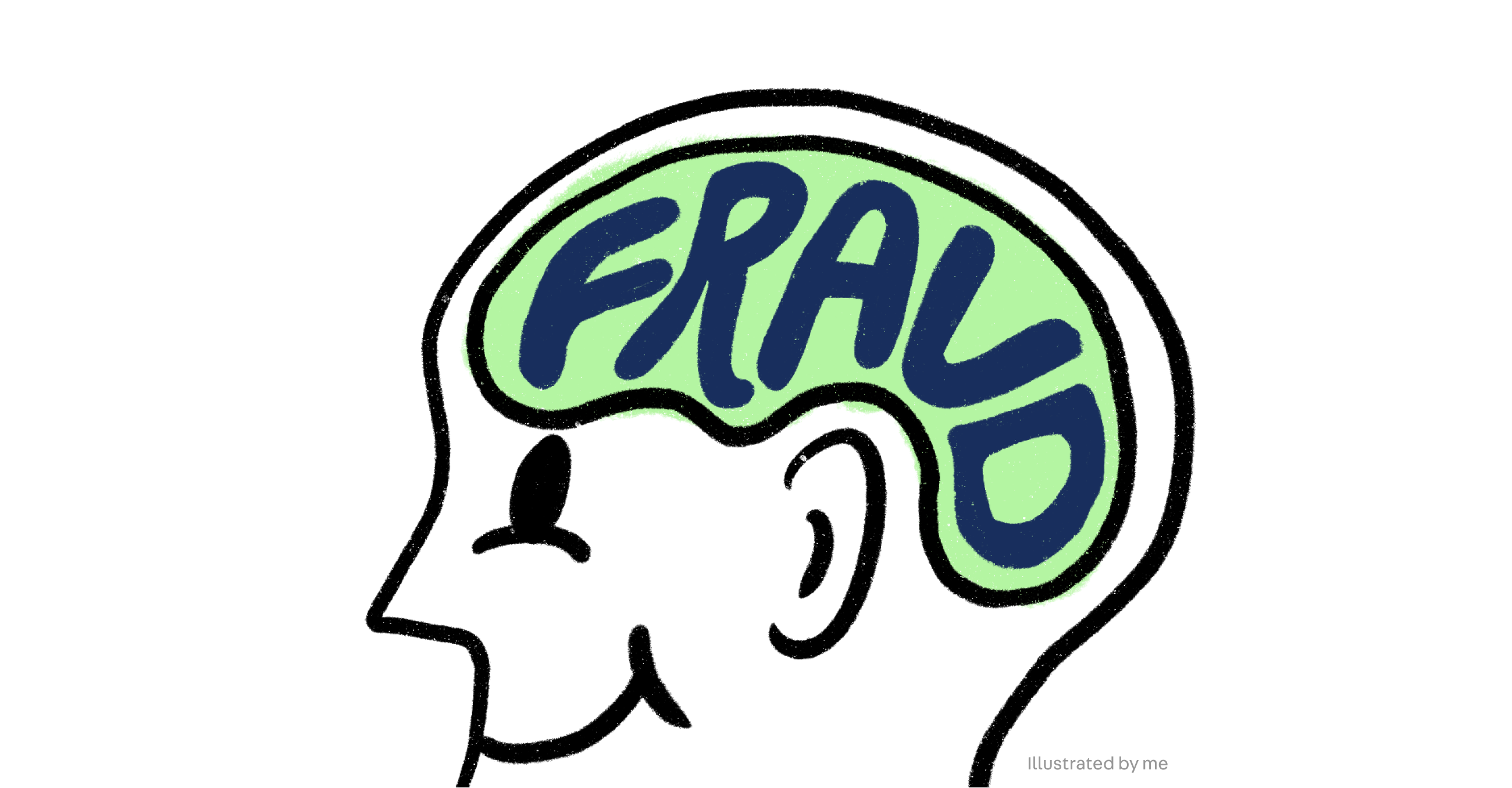
Introduction
At first glance, fraud prevention might sound overly technical—or even a little dry. But working in this space turned out to be one of the most eye-opening experiences.
I found it fascinating to step into the mindset of fraudsters. Understanding their motivations, how they exploit systems, and most importantly, how to design against them.
In this case study, I’ll share 4 key lessons I’ve learned in my time at fraud prevention team.
Role
I led end-to-end design, prototyping and final implementation for all case studies below, with copy support from UX writer and contributed to some degree of data analysis.
⚠️ Note: For privacy reasons, some screens and sensitive details have been concealed.
#1 simplifying vs. resistance
Problem
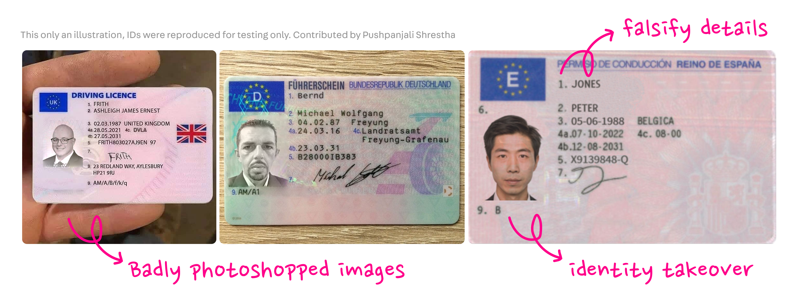
There was an attack on our ID verification flow, where fraudsters submitted fake, often absurd IDs — and some were mistakenly verified. By examining how easily these breaches happened, we uncovered critical weaknesses to address.
Examples of fraud IDs:
Before
• Bad actors could easily trigger the flow to reclaim or reset a phone number
• Even if they couldn’t always complete ID verification, they could spam attempts, resulting in a flood of fake IDs being created in the system.
Higher resistance may be needed in sensitive flows
It was essential to have build stronger defenses earlier — especially in sensitive flows like phone number resets.
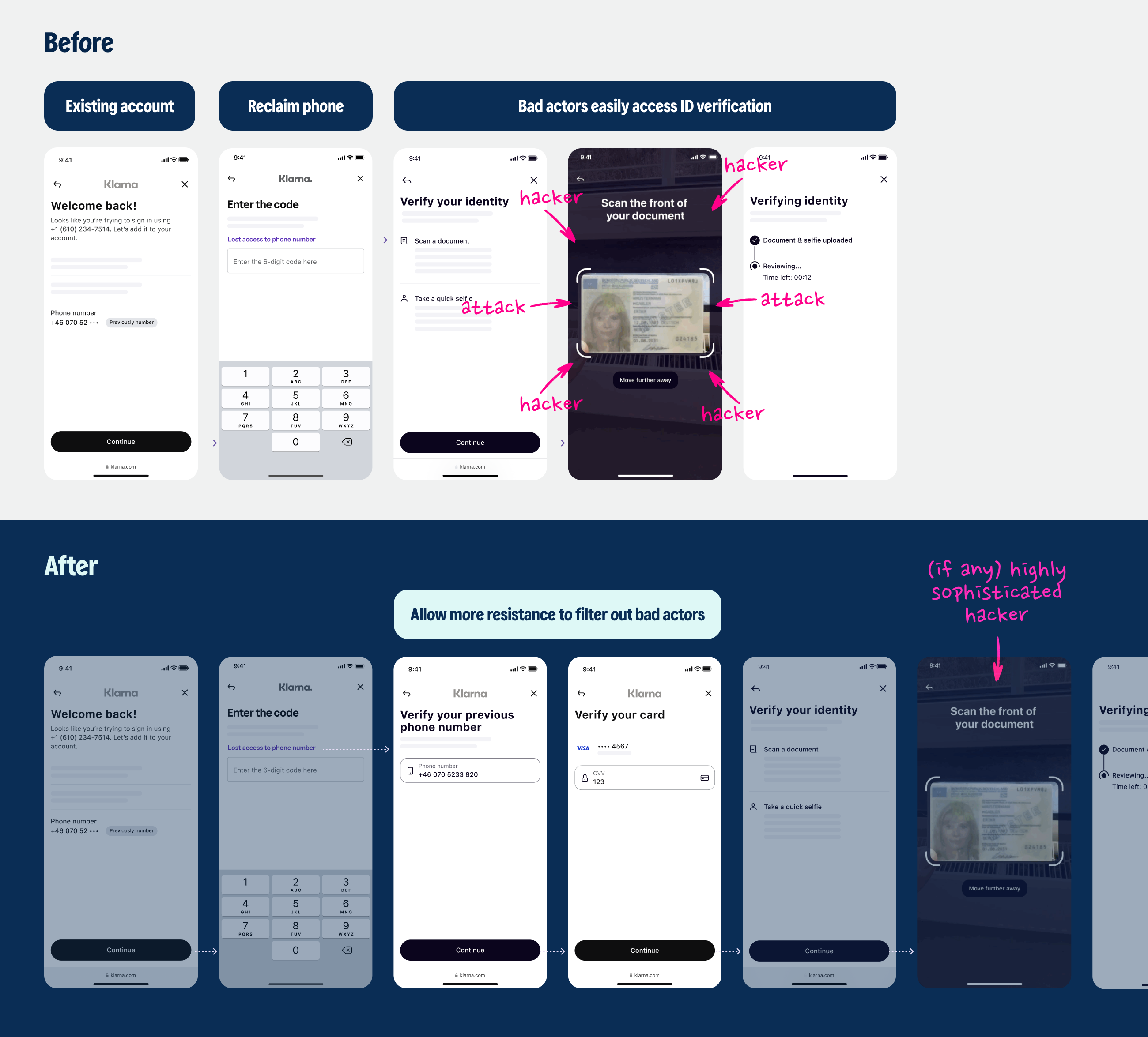
After
• We added more friction and screening steps before users could even reach ID verification.
• This successfully filtered out most bad actors, making it much harder to even attempt ID verification without legitimate credentials.
Sometimes we may have to add friction in our design — a counterintuitive but crucial shift in mindset.
With this, it will now take a much more sophisticated hack.
#2 Conversion Rate vs. Fraud Risk
In fraud prevention design, it's a constant balancing act between maximizing conversion rates and safeguarding against attacks.
Adding more steps inevitably impacts conversion and by extension, profit margins.
It is a deliberate choice. Prioritising security to protect our genuine users.
Using the same example above, let’s look at the conversion rate:
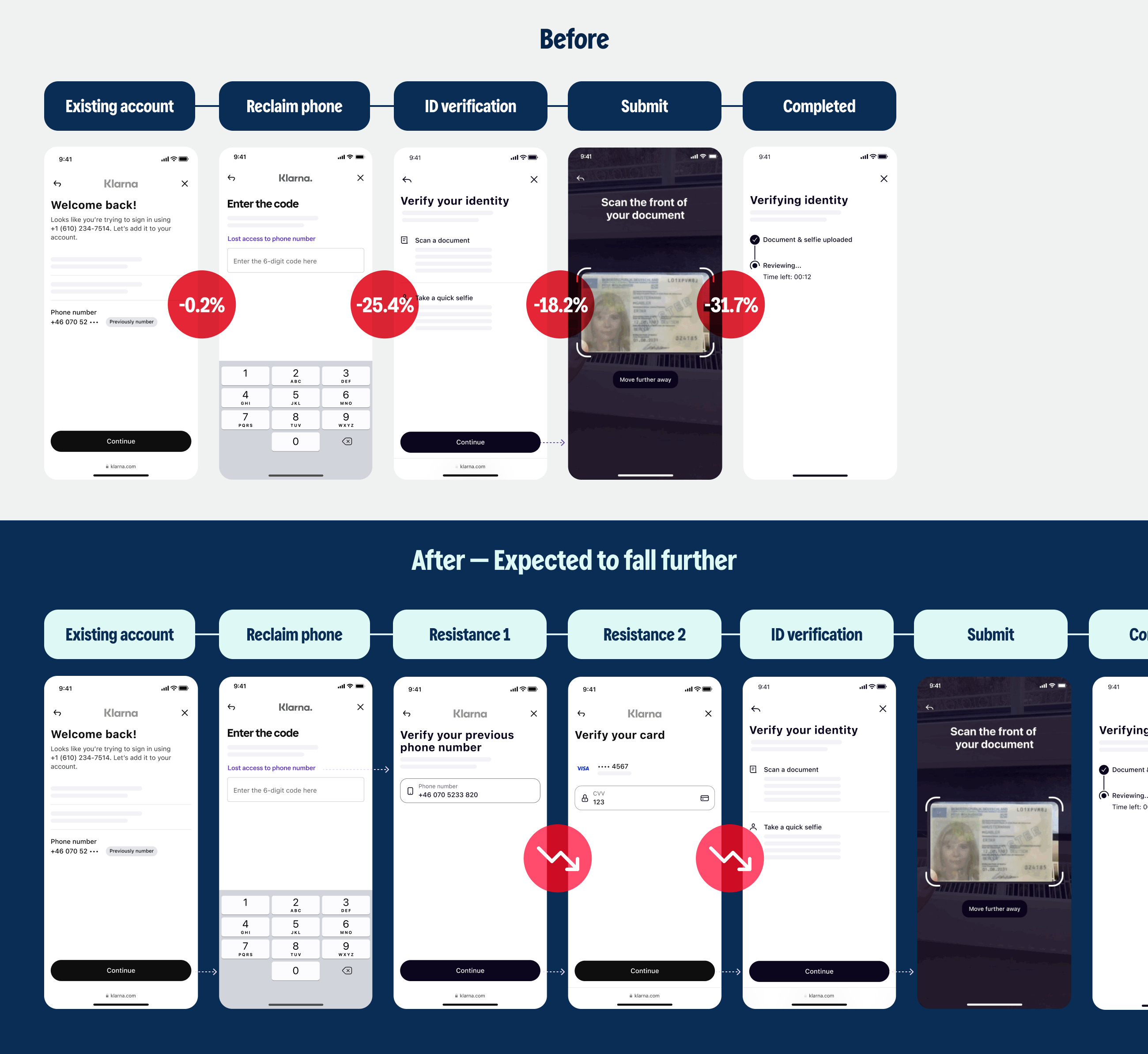
I’ve learned that we have to make necessary tradeoff to block bad actors and strengthen security.
Preventing fraud isn't just about saving money — it’s about preserving trust, reputation, and long-term brand integrity.
#3 Clarity vs. Over-exposure
Another key balancing act in fraud prevention is finding the sweet spot between giving users full transparency and protecting sensitive information from potential abuse.
The Challenge
We could easily reveal detailed data — like exact device models or location mismatches — to help good users spot suspicious activity. However, oversharing this kind of information could also equip fraudsters with valuable clues to game the system or target vulnerabilities.
Example
When there are suspicious device or location mismatch, we could show all the meta details. While it would increase clarity for genuine users, it could inadvertently expose too much to bad actors.
Let’s compare our approach with some of the more risky alternatives:
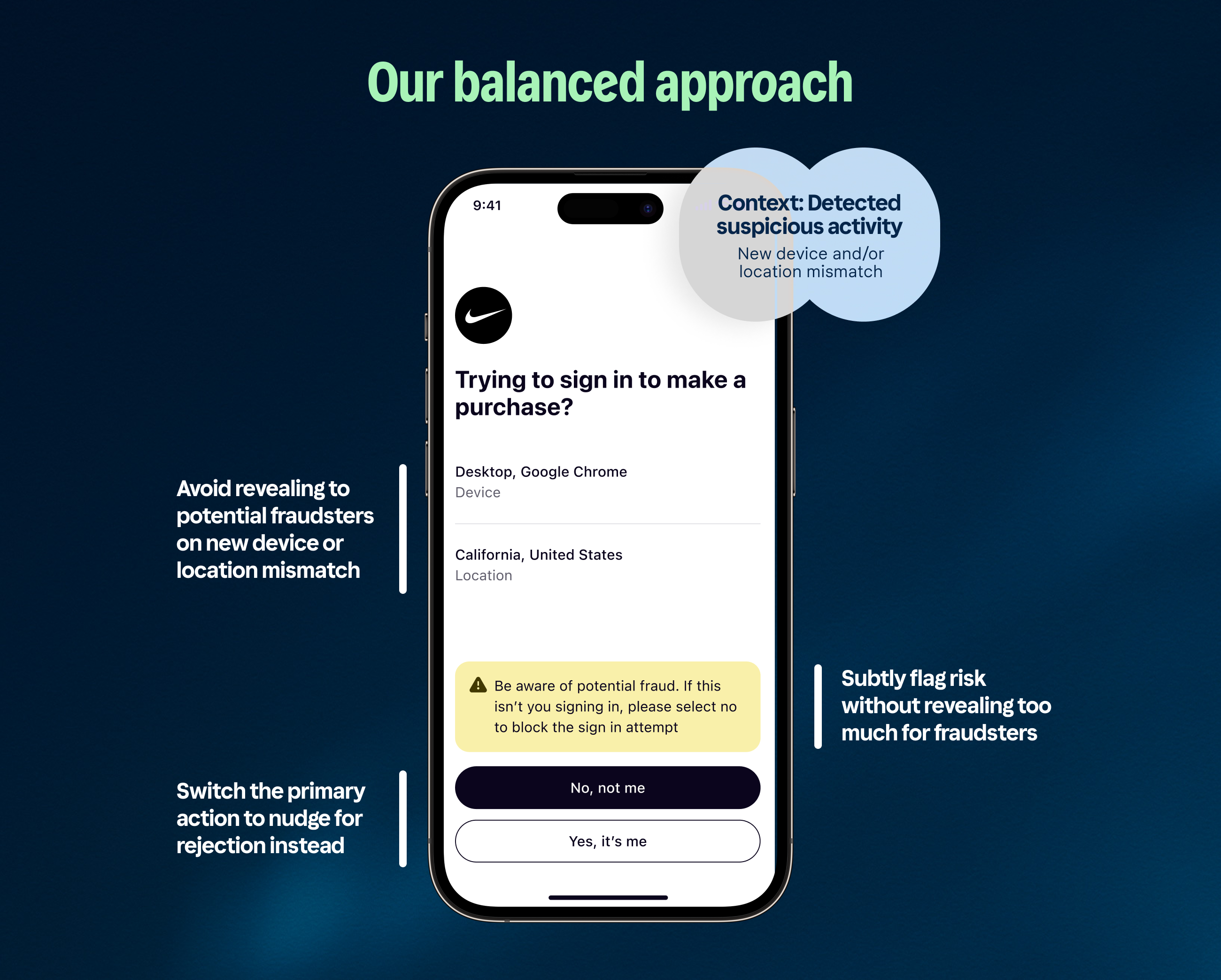
Our Approach
Instead of overwhelming users with sensitive data, we focused on surfacing just enough information to alert and empower them, without giving fraudsters an easy playbook.
Sometimes, protecting users means not offering 100% clarity.
If I designed only with genuine users in mind, I’d instinctively highlight every mismatch. But in designing against fraud, holding back can actually keep users safer.
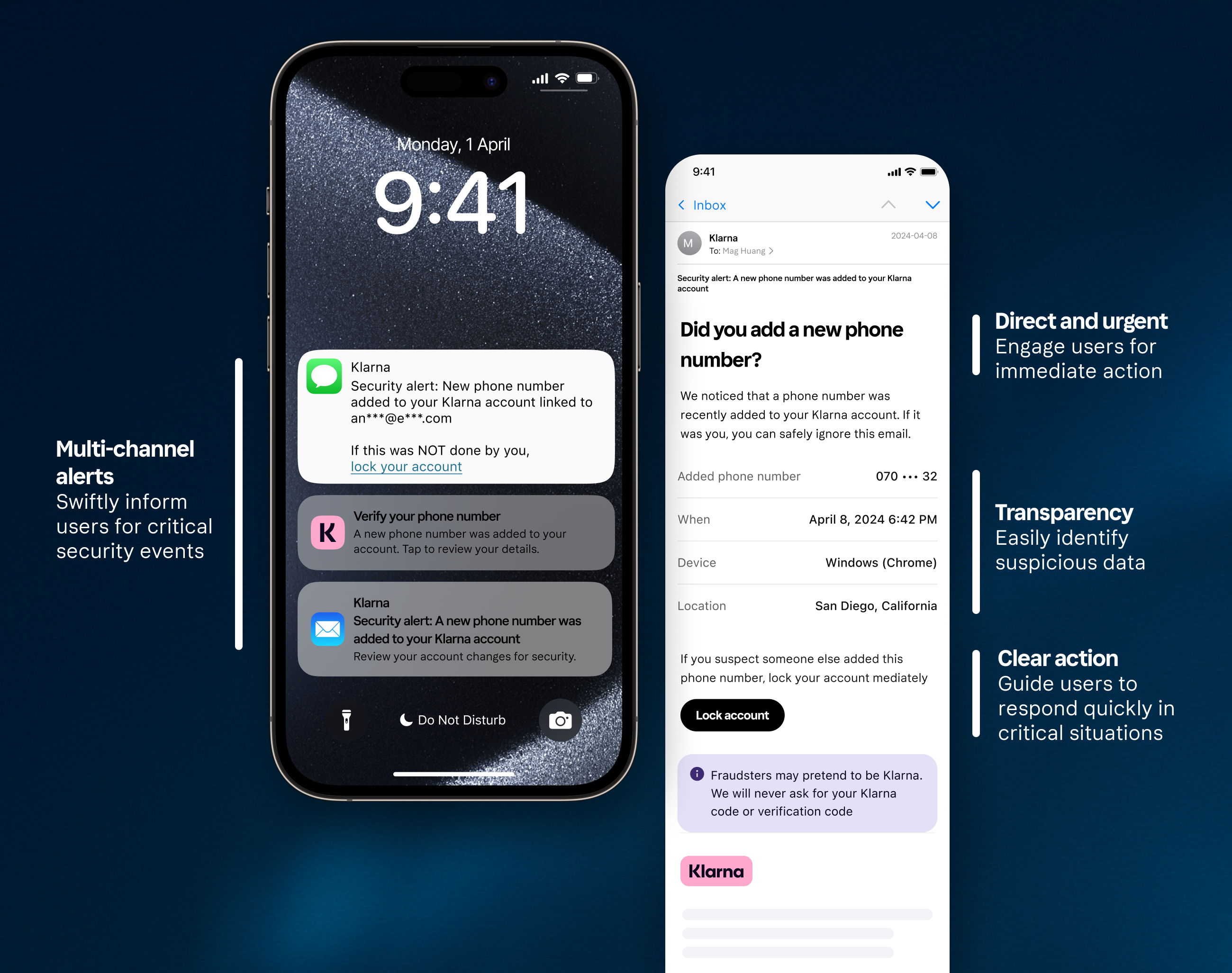
#4 Quick recovery is critical
What happens when a fraud attack does succeed?
That’s where I learned how crucial fast recovery becomes.
At this point, the focus shifts: we must quickly guide users through recovery steps. Whether it’s locking their account, freezing suspicious purchases, or connecting them with our support team.
Example
When a bad actor manages to take over a genuine user’s account, how fast and clearly we respond can make all the difference.
Designing for immediate action helps to protect users and restore trust quickly.
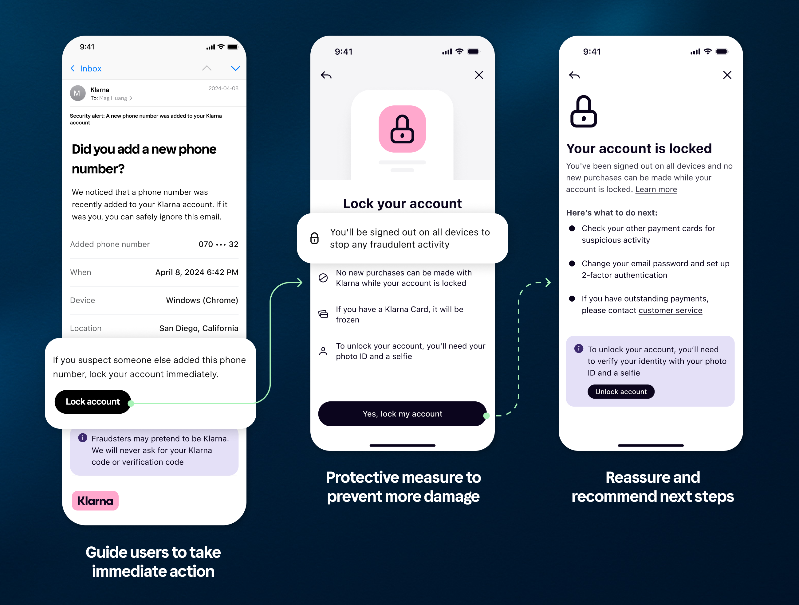
In the illustrated flow above, we designed multi-channel notifications to quickly alert users during security-sensitive events. Each touchpoint guides users toward immediate action — prompting users to lock their account as a protective measure against further harm.
Designing for fraud isn’t just about prevention.
It is also about enabling swift, reassuring recovery when things go wrong.
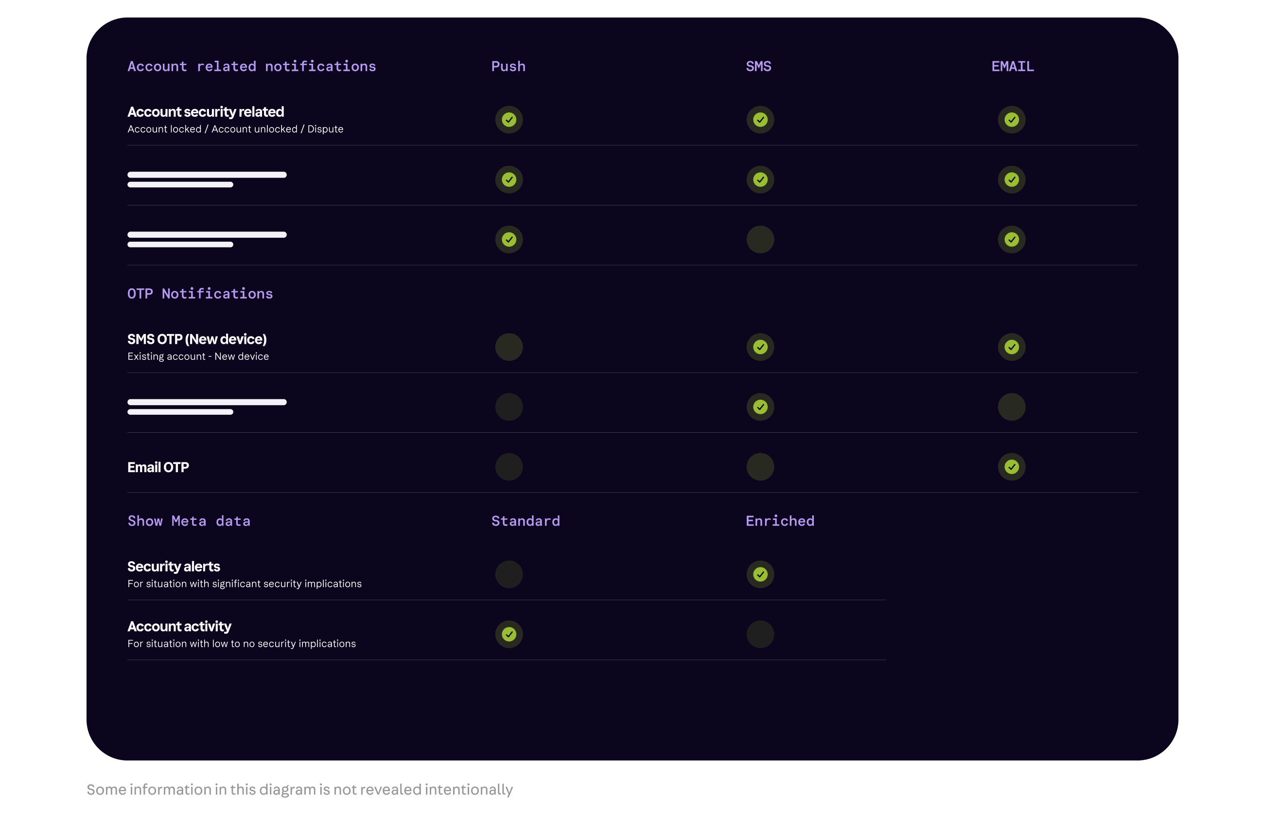
Mapping the communication strategy
Working with product, I mapped a multi-channel notification plan based on risk and urgency — ensuring users are alerted quickly and clearly during critical fraud events.
Defining the communciation strategy
Partnering with our UX writer, we crafted clear, action-driven security emails — ensuring users get the right information at the right time to act quickly and confidently during incidents.
Final Reflection
Working in fraud prevention completely reshaped how I think about design. I learned that good design isn't always about making things faster or easier — sometimes it's about adding thoughtful friction to protect users.Designing with fraud in mind means balancing user clarity, security, and trust at every step.
To anticipate not just the needs of good users, but the tactics of bad actors as well.
Every decision — from where to introduce resistance, how much information to reveal, to how quickly we help users recover — became part of a larger strategy to keep users safe without compromising their experience.
Moving forward, designing for trust and safety is no longer a side consideration but a core part of designing great user experiences.