Introduction
I was part of an in-depth research initative on new buyers’ shopping behaviours and usage patterns on Carousell — one of the fastest-growing secondhand platforms in Southeast Asia.
Not your typical design case-study
For this project, I will share how I’ve translated research insights into clear, compelling stories to drive company-wide resonance.
For more project details, my team mate Felipe Becker has done a nice write up here
Opportunity
Given the depth of this research, we had extensive findings and insights.
But that got us thinking...
How does one make research resonate company-wide?
To make our research stick, I turned to what works best and what I’m passionate about—visual storytelling.
The journey began with uncovering new user patterns
To improve success and retention for new and early-stage users, it’s important to understand new user's buying journey—from discovery to purchase.
After diving into 70 new buyers (interviews, reviews, and experiments), clear trends surfaced.
We mapped user’s behaviours along two actionable dimensions;
1. decide-discover (informs usability)
2. search-browse (informs listing relevance)
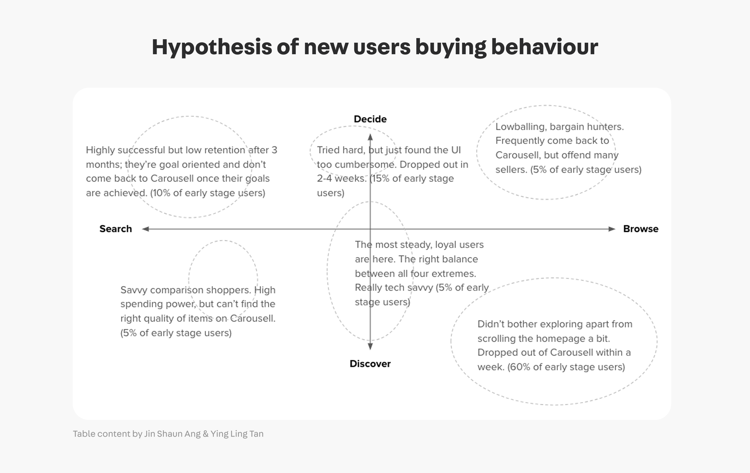
We categorised new buyer types to evaluate alignment between their goals and experience on Carousell—highlighting key behavioural patterns and usability gaps.
We then shaped user types based on real user stories
By analysing user stories and user reviews, we uncovered behavioural patterns that allowed us to form clusters and clearly define distinct user types.
Quantitative insights guided deeper analysis
To get the full picture, we examined our user’s journey and and conversion rate at each step to better understand how new users are navigating the app.
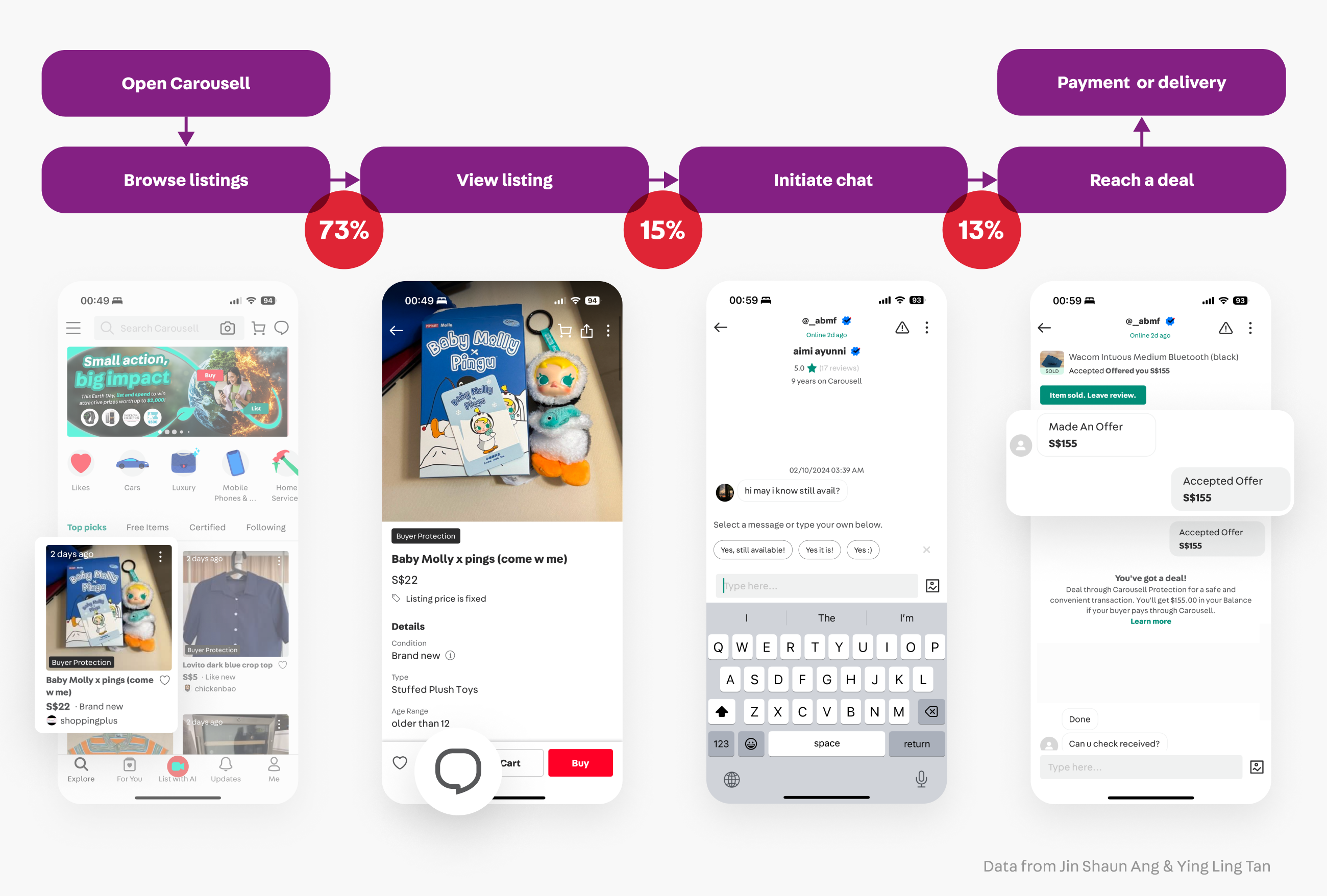
We arrived at some key insights
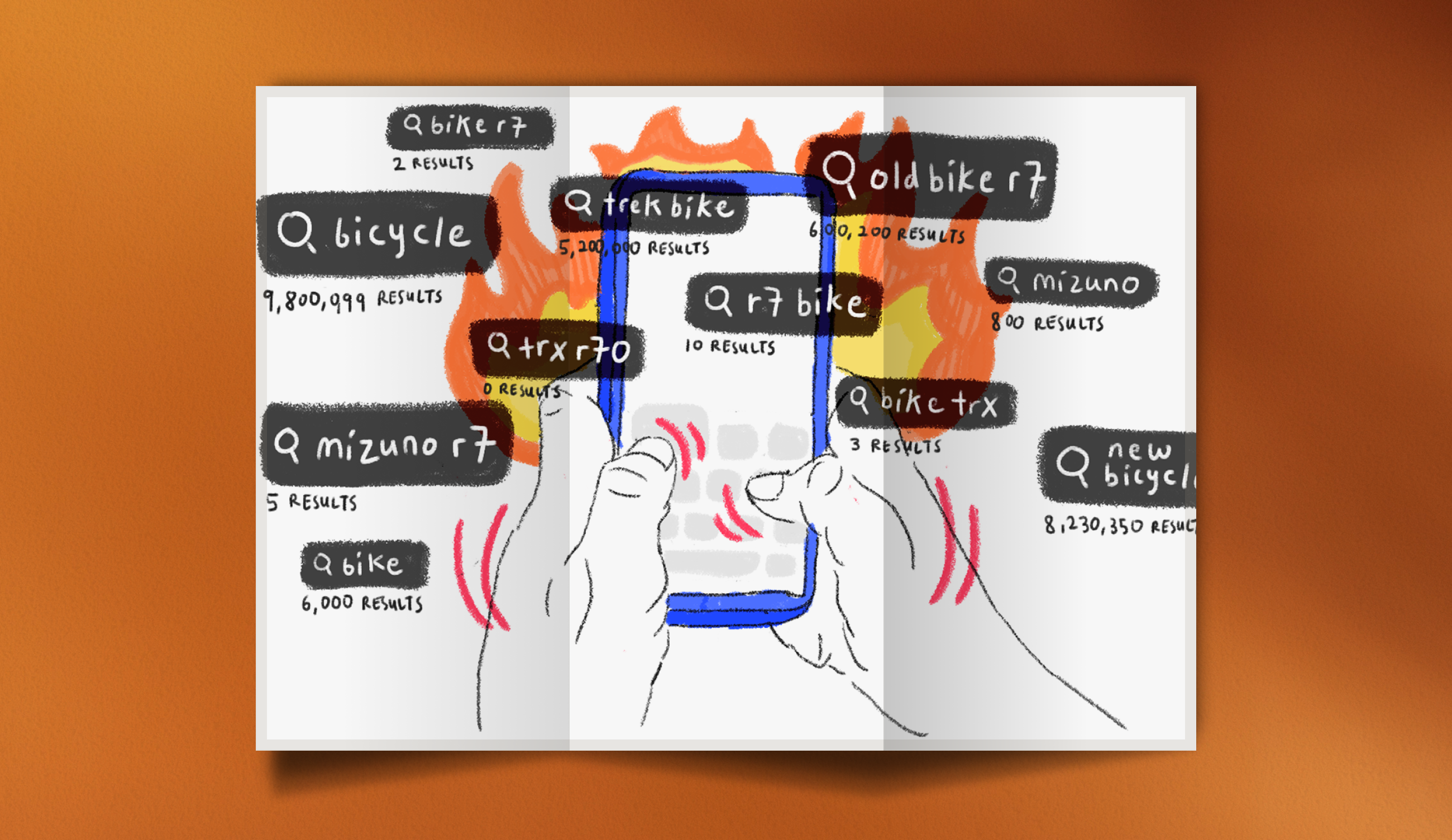
• Search-savvy users succeed — When new users know what to search, they can find almost anything
• Discovery loop — “Similar Listings” keeps users browsing—driving deeper engagement
• Search evolves — Buyers pick up keywords from listings, expanding their search language quickly
• Wide + narrow tactics — New buyers toggle between broad and targeted searches to explore every option.
A clear narrative began to emerge
As our research progressed, recurring themes and insights crystallized, helping us define a focused story for new users.
We refined our ideation into a more structured, visual storytelling approach to effectively communicate our findings.
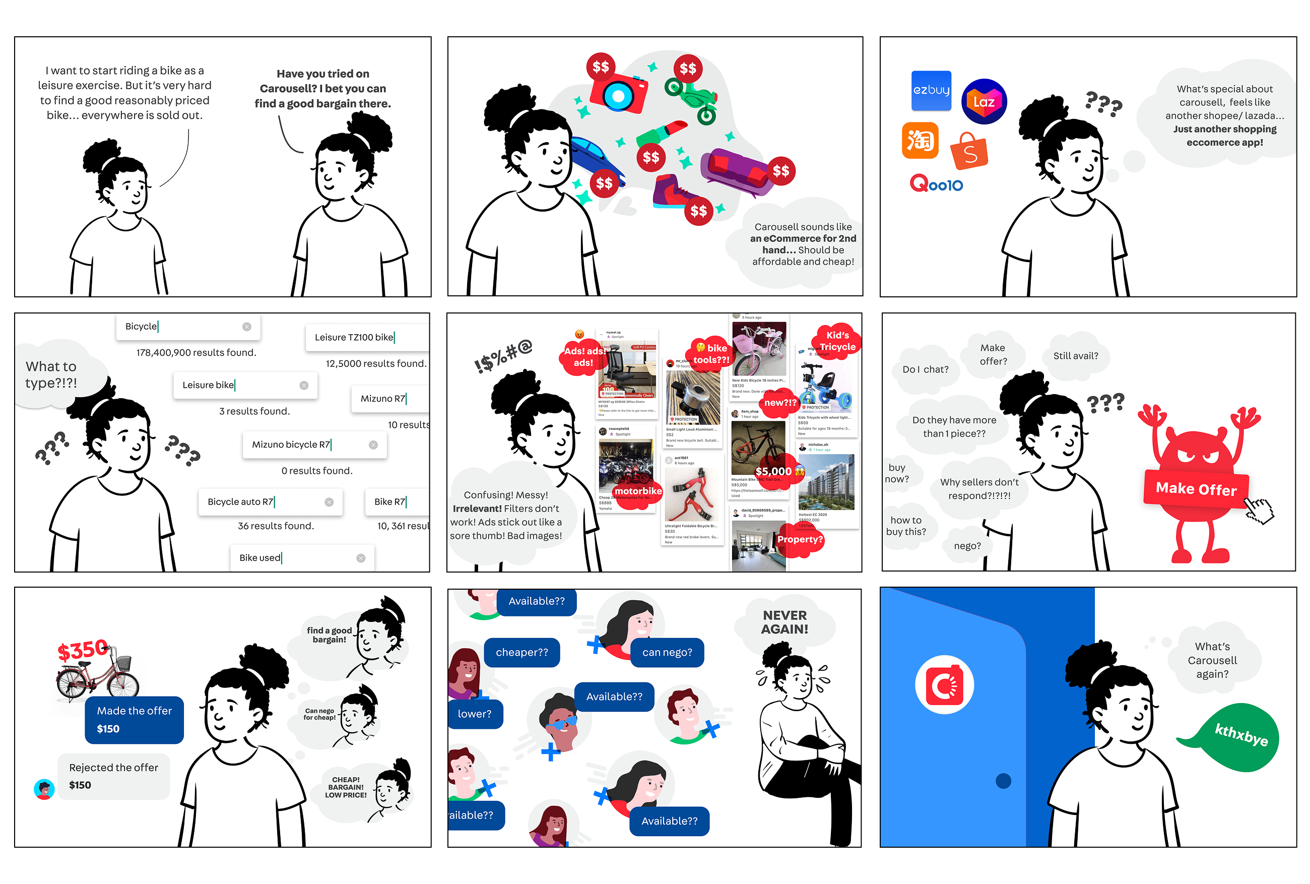
Where It All Came Together
This is the final outcome, a 9-tile story that distills our user research into powerful, visual insights.
Storytelling turns heavy research reports into memorable, bite-sized visuals.
Each tile spotlights a key pain point, need, or want, making it easy for stakeholders to see what matters most to our users.
Impact at a glance
✅ Featured in company reports & team share-outs
✅ Visually sharp, insight-rich, and straight to the point
✅ Drove faster buy-in with clear, engaging storytelling
✅ Hand-drawn style kept insights human, real, and relatable
Stakeholders quickly grasp key takeaways—fueling action and alignment across teams
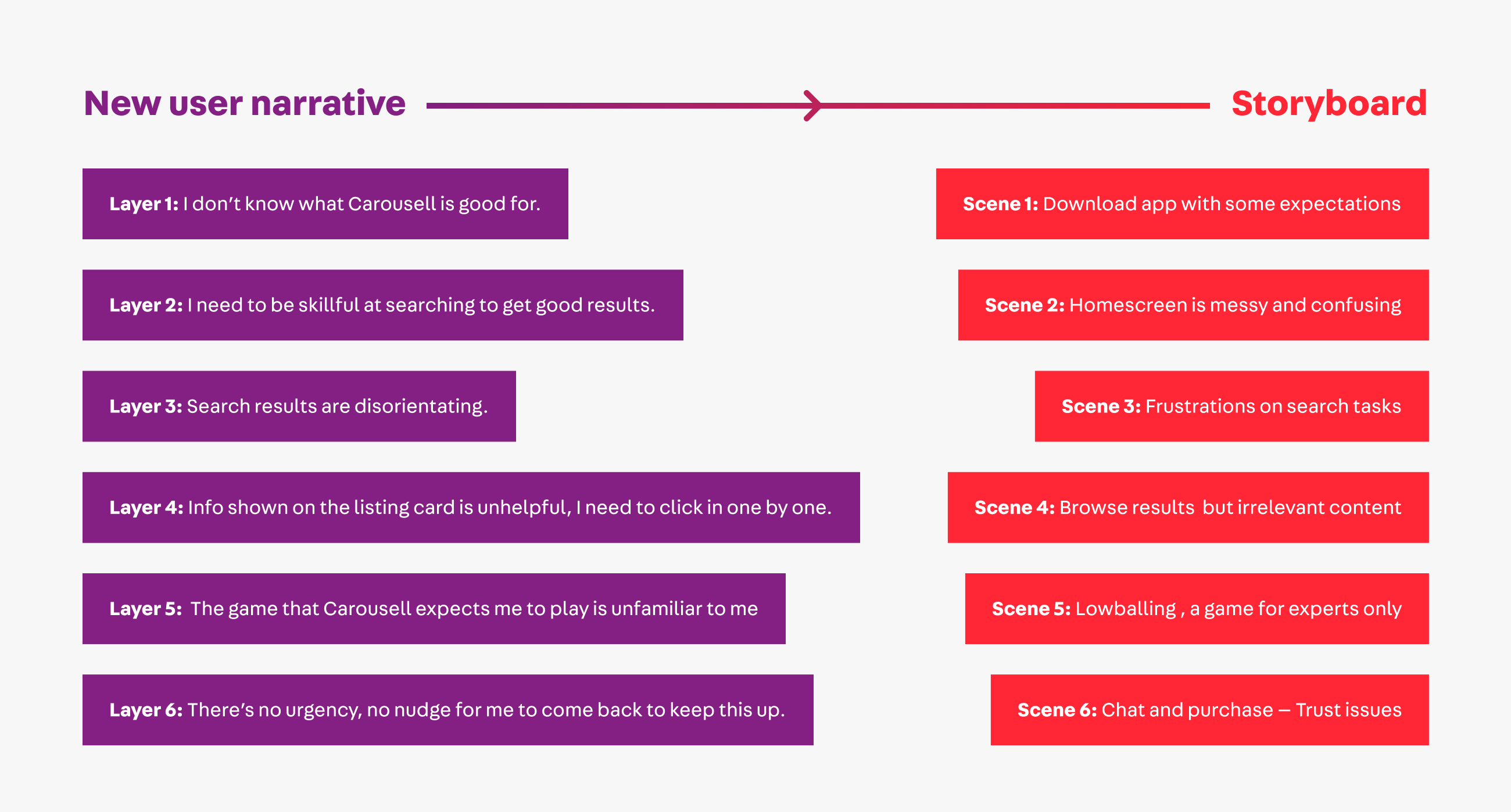
Bringing the Story to Life
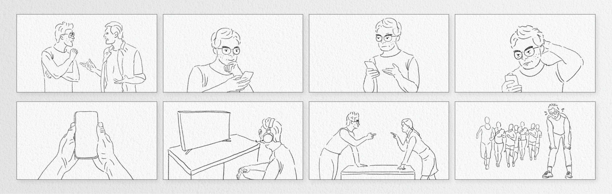
As the research evolved, so did the visual language. I gradually refined the illustrations—shifting toward a cleaner, hand-drawn, semi-realistic style that felt both human and grounded.
Here’s a snapshot of the early storyboard framework—capturing key scenarios before layering in the details, emotion, and color.
And going back even further, this was the earliest draft as research continues to run in parallel. As our research insights sharpened, the story evolved, shaping both the narrative and design direction altogether.
Final thoughts
I love bringing illustration into the UX field—it’s something I enjoy, and I believe it adds a personal and relatable touch to our user stories.
Effective storytelling turns research findings into memorable stories that inspire meaningful change
I draw frequently, check out my Doodles section for more of my artwork!