Background
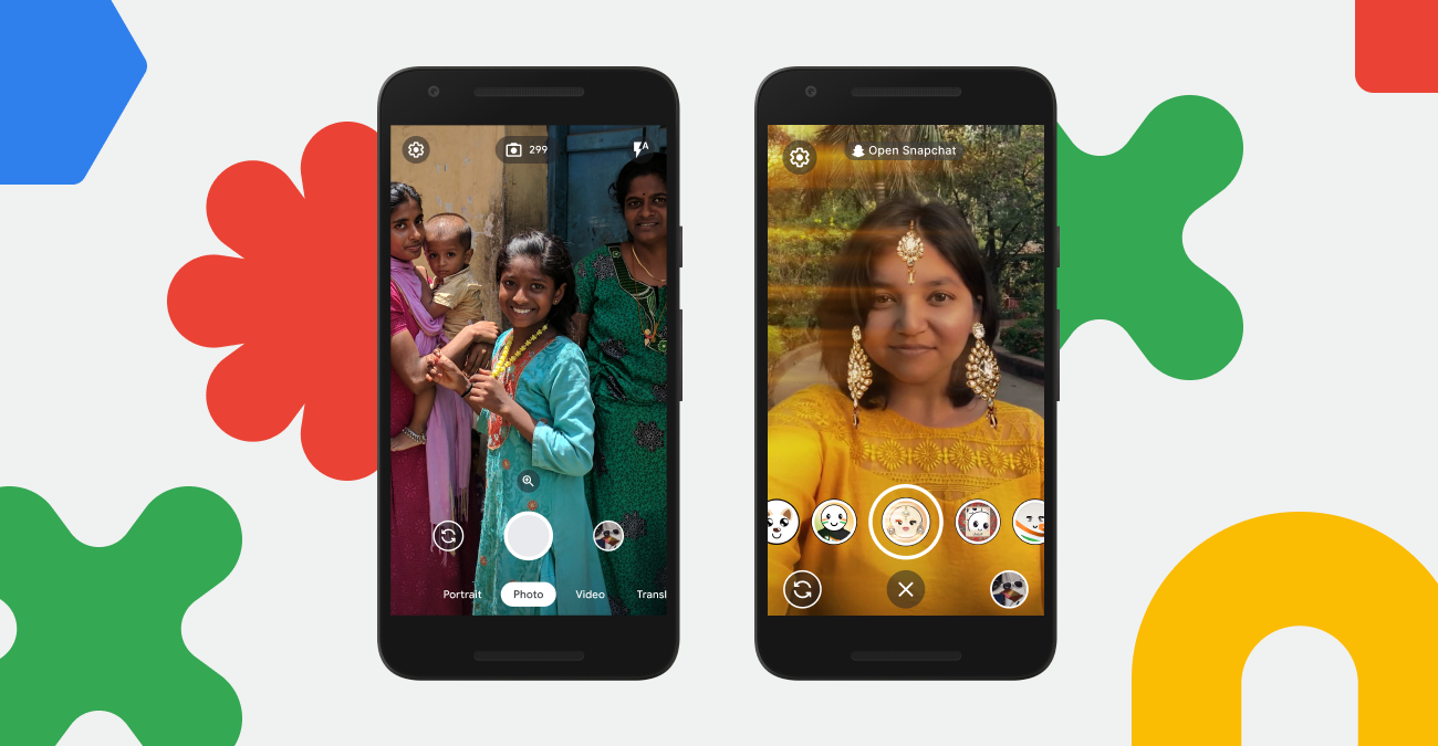
As part of the Google Camera Go initiative, I was part of the groundbreaking project that brought Snapchat's iconic AR filters and AI experiences to low-end Android devices. By partnering with Snapchat, we aim to revolutionize the visual experience on budget-friendly smartphones, empowering New Internet Users with creative tools and immersive features previously accessible only on high-end devices.
This collaboration democratizes technology and fostering inclusivity in the digital photography realm.
Role
I was the primary end to end designer in this project from ideation to development
Opportunities
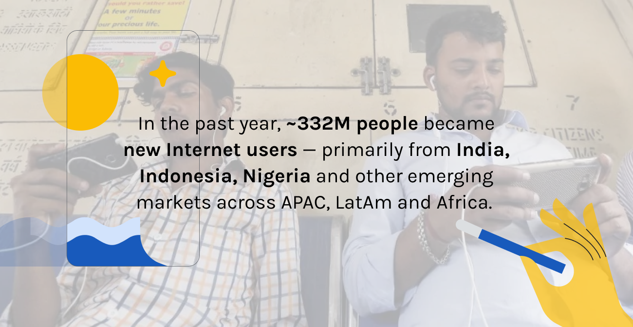
Bringing AI experiences and AR filters to low-end android camera and democratize access to digital photography
1. Users are not all as tech-savvy or accustomed to using advanced features like AR filters and AI experiences. Providing clear and intuitive guidance within the app interface is essential to empower users to easily discover, access, and engage with these AI experiences
2. User interface (UI) optimization is critical. Many low-end Android devices have smaller screens compared to their high-end counterparts. Designing Snapchat's interface to be intuitive and user-friendly on these devices requires careful consideration of layout, icon size, and touch targets for all users, regardless of the device they are using.
There are 3 critical pillars to consider when we bringing snap experience to our users;
Awareness, familiarity and onboarding.
Help our users express themselves with AR filters that are inclusive, enjoyable and easy for all to use.
Key results
1. Snap integration — Bringing AR stickers, filters, face retouch features to low-end Android cameras
2. %Adoption and %return usage of Snap mode
To bring awareness
How might we;
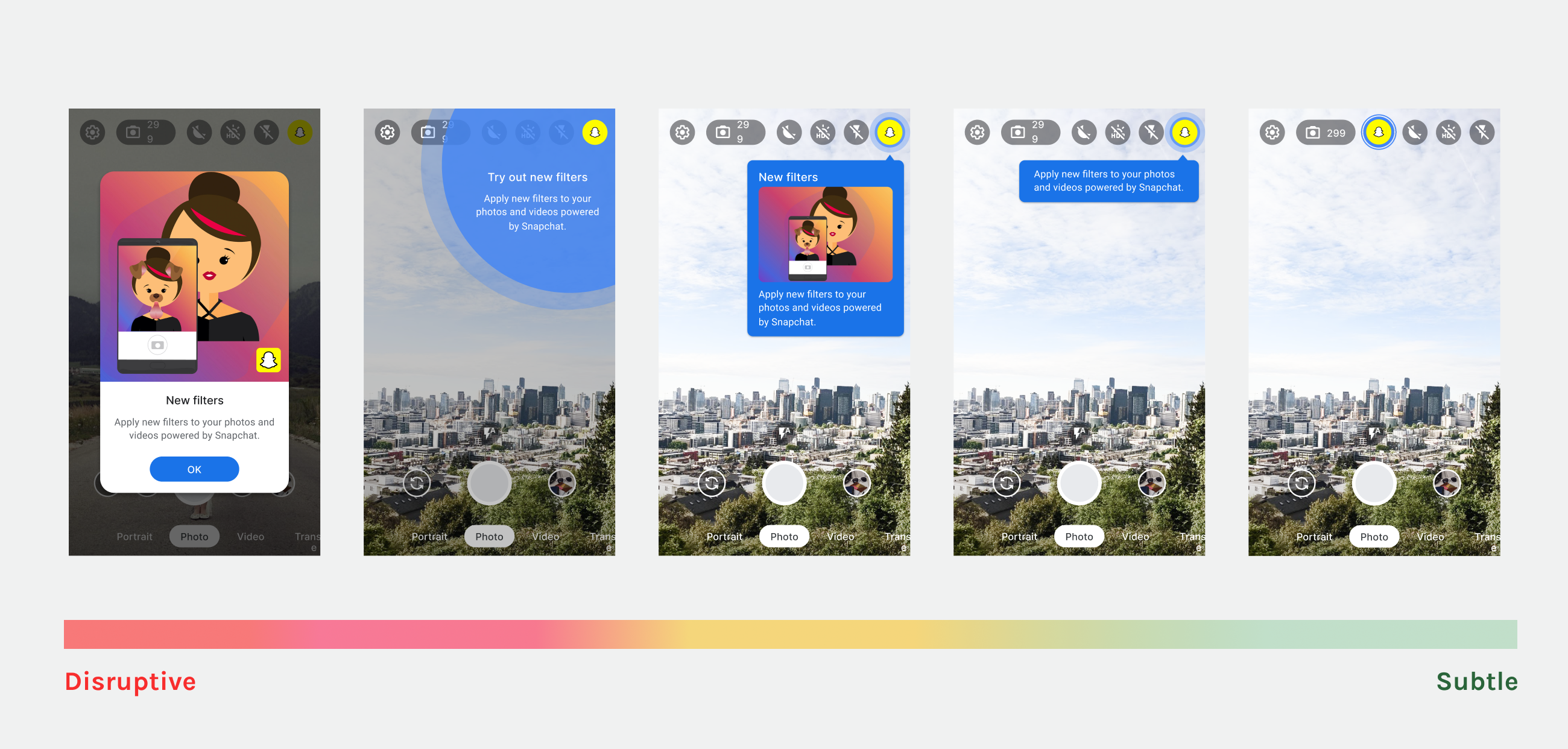
• Prompt and nudge users into trying out Snap mode?
• Quickly and explicitly show what Snap mode is?
• Balance Snap mode's prominence against normal camera
To visually onboard our users
Thoughts;
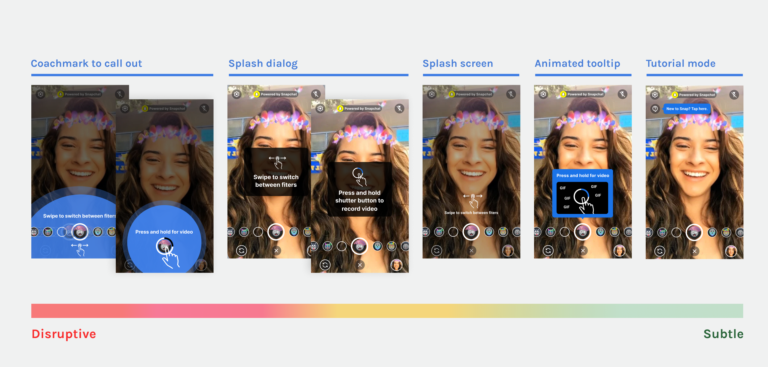
• What are considered new interactions for New internet Users?
• How would users best experience Snap mode?
• Best in class visual cues and guidance
Principle — No abstraction, always literal
Our key design principle when designing for this audience — Literal visual education
· Avoid abstract icons or visualisation
· Be very literal in our visual cues
· Use recognisable day to day elements
How we applied this principle even to the minor details:
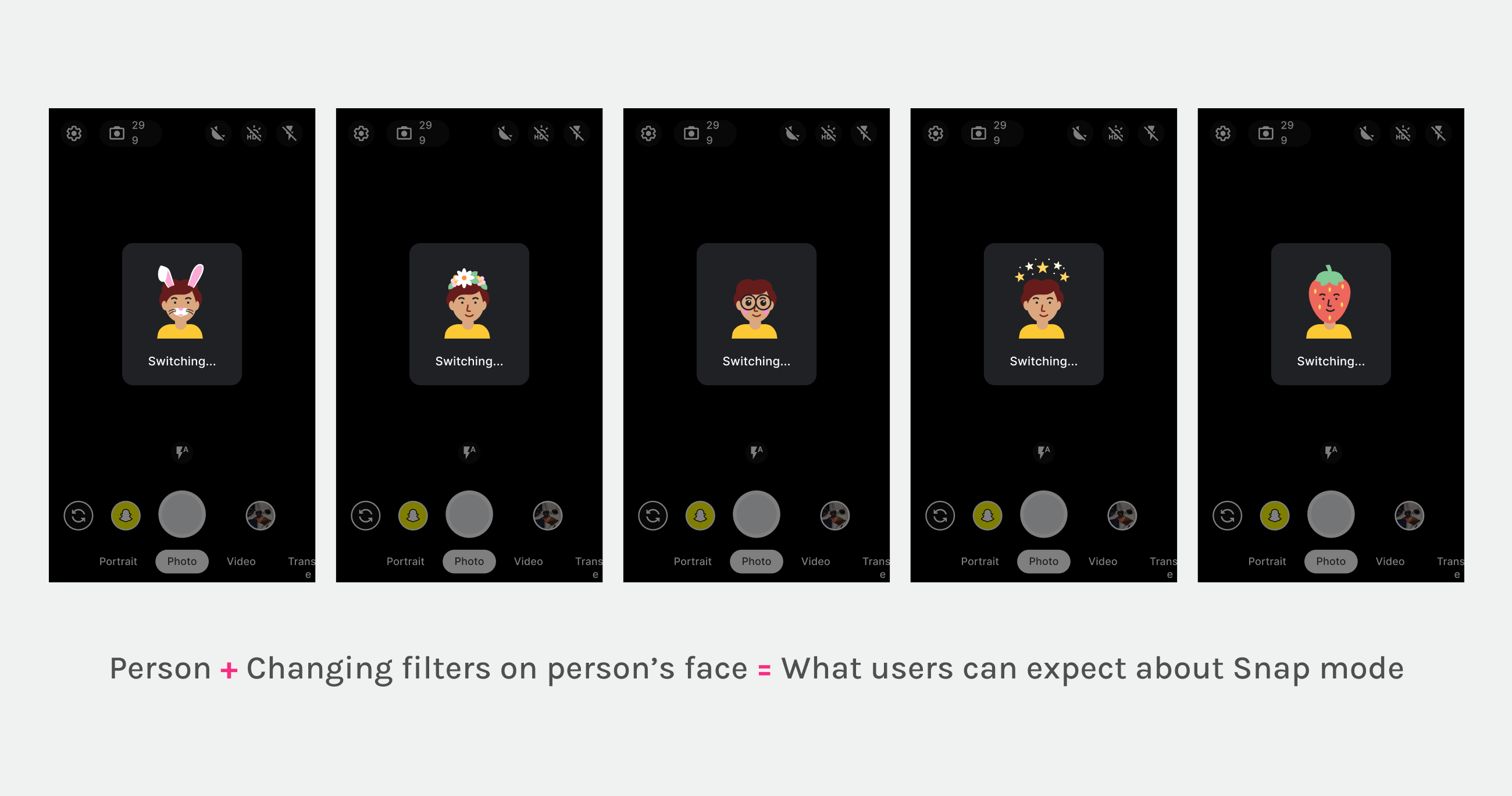
To teach users what they can expect from Snap mode, our transition animation is intentionally designed such that it features an illustration of a person with changing filters.
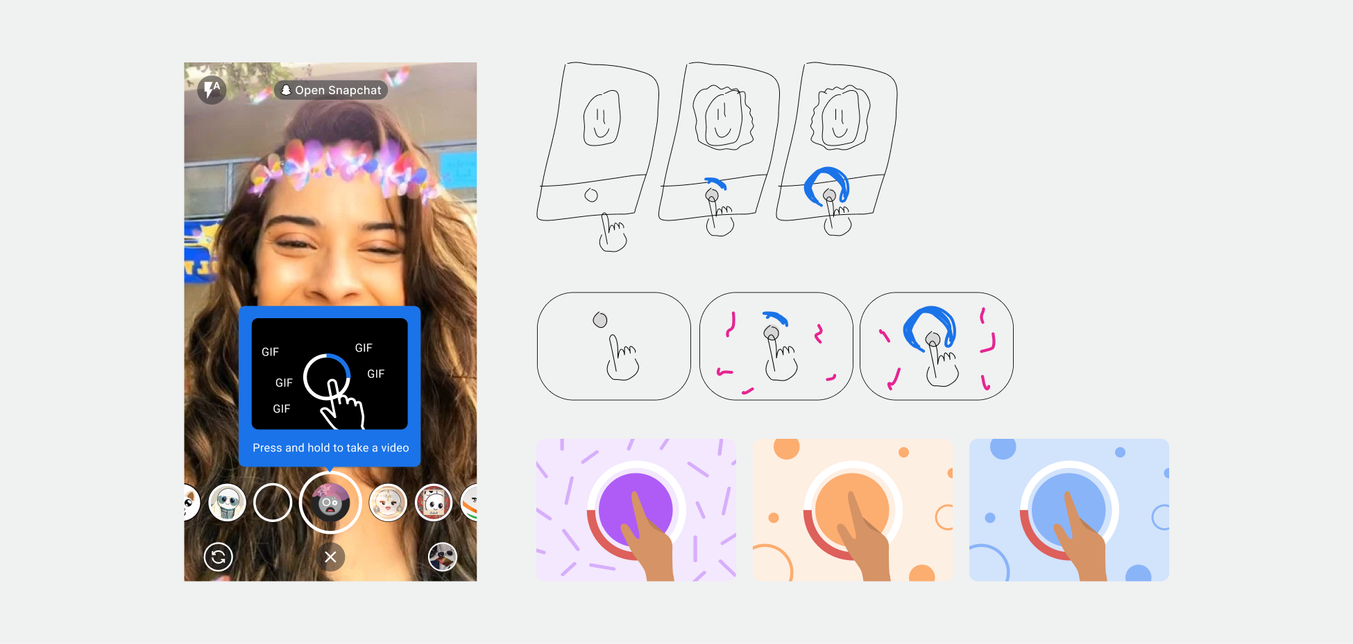
Archived visual explorations
I really enjoyed the entire conception of this project. We had alot of archived visual explorations that I thought would be fun to share a glimpse of it.
Through this process, I got to collaborate with other designers to create impactful animations and learned how to convey details through motion. As we pair motion with effective copy and attractive visuals, it is almost always a deadly combination!
Impact
1. Snap mode with AR filters went into live production. Camera support from Google
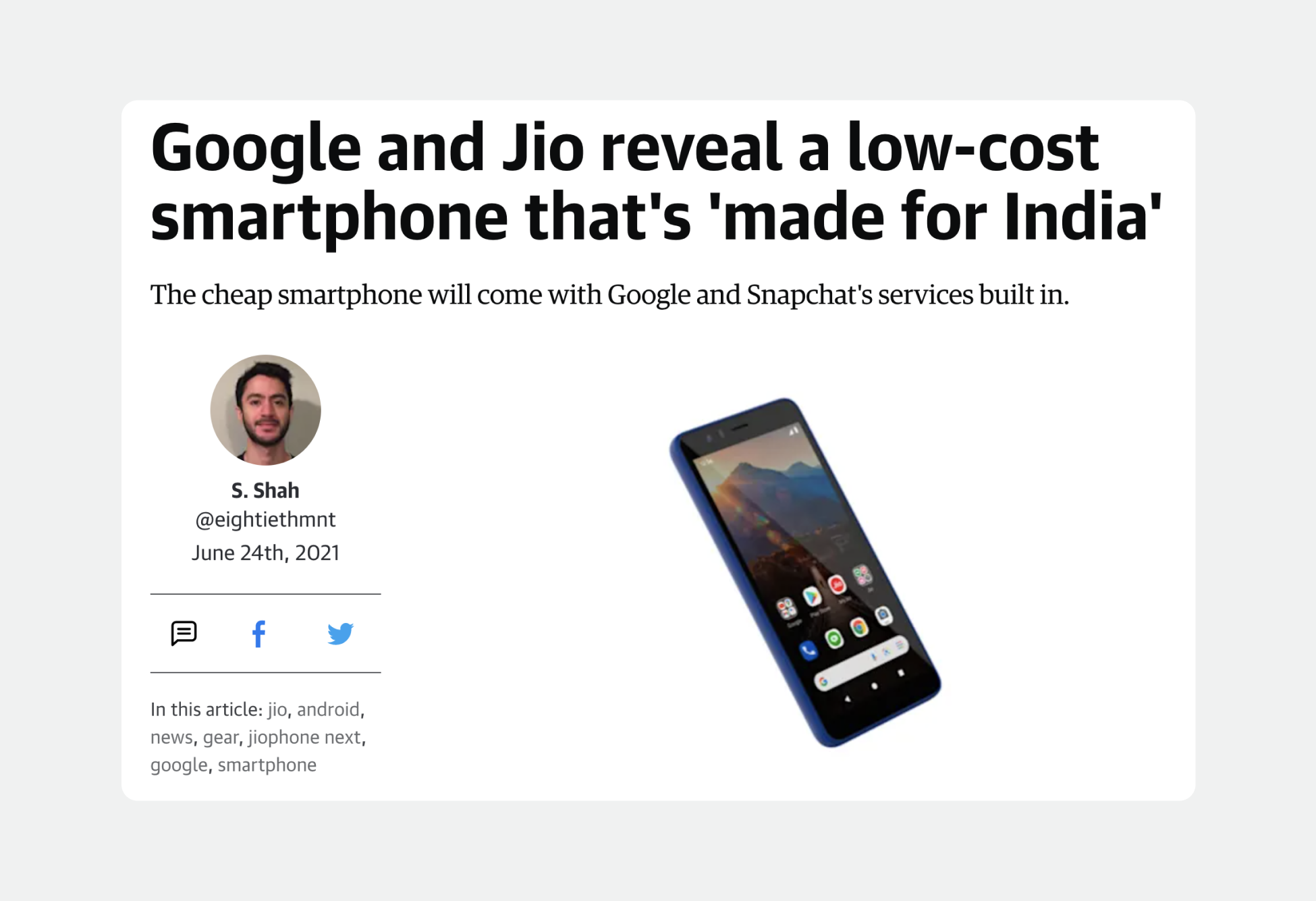
2. Camera Go Google was also launched with Jio. Introducing JioPhone
· Jio is one of the biggest telco in India. This collaboration meant that we were able to integrate Indian-specific Snapchat Lenses directly into Camera Go. This creates a much more immersive and innovative photo-taking experience for our users.
Summary
As we bring Snap mode to India for the first time, there were huge ethical considerations when it comes to face enhancements (brightening, smoothening etc.).
We also considered the localisation of Snap filters that are always fun, relevant and inclusive for all our Indian users.
Examples that we considered:
· Reject filters with excessive facial retouch such that it creates an unhealthy image standard
· Reject filters that attempts to 'brighten' skin overtly
· Reject usage of any animals that are sensitive to religion
· Food and festivity were two areas that was well-recieved.
How interesting to be involved in these conversations and discussions on inclusivity and localisation. In summary, it was a super eye-opening design process.